Examples
This page provides a gallery of examples to showcase the plotting capabilities of PlotlySupply.jl. Each example includes the Julia code used to generate the plot and the resulting figure. These examples are designed to help you get started with the package and demonstrate how to create a variety of common plot types.
plot_scatter
Scatter plots are versatile and can be used to visualize relationships between variables, such as in line charts, scatter plots, or a combination of both.
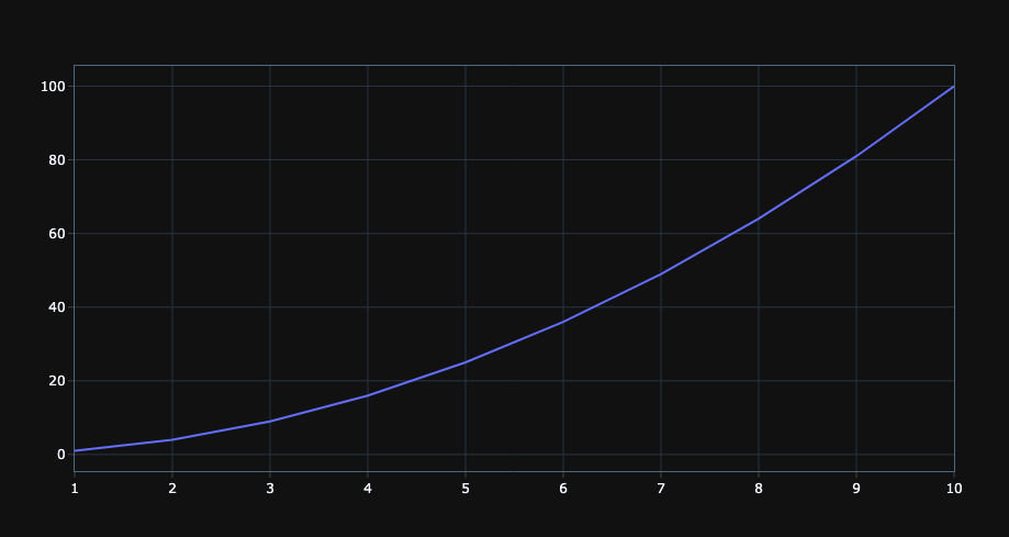
Simple Line Plot
This example demonstrates how to create a simple line plot of a quadratic function. We define our x and y coordinates and then pass them to plot_scatter with labels for the axes and a title.
# Simple line plot
x = 1:10
y = x.^2
fig = plot_scatter(x, y, xlabel="X", ylabel="Y²", title="Quadratic Function")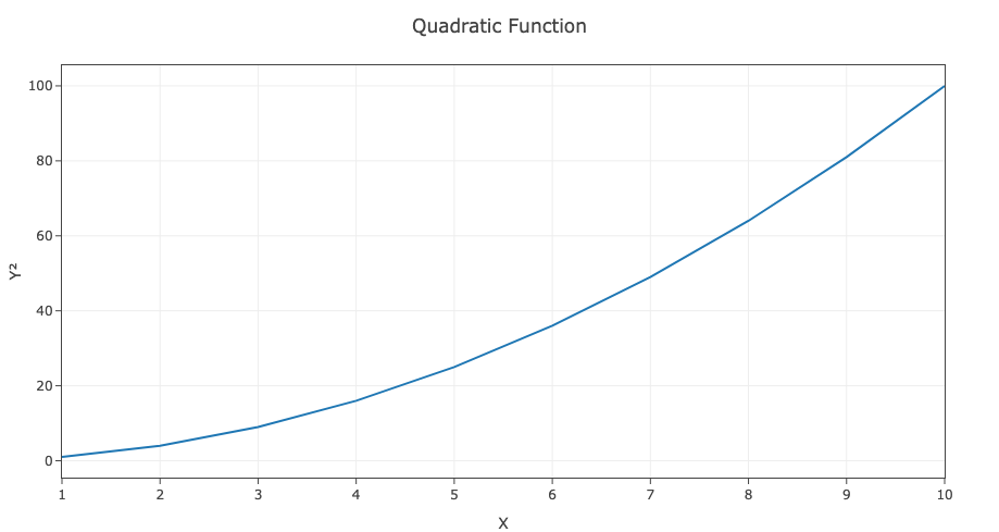
Multiple Lines with Different Styles
Here, we showcase how to plot multiple lines on the same axes. We can customize the appearance of each line by specifying the mode, dash, color, and legend for each dataset.
# Multiple lines with different styles
x = 1:10
y1 = sin.(x)
y2 = cos.(x)
fig = plot_scatter(x, [y1, y2],
                   mode=["lines+markers", "lines"],
                   dash=["", "dash"],
                   color=["blue", "red"],
                   legend=["sin(x)", "cos(x)"])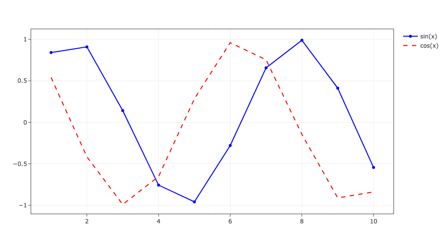
plot_stem
Stem plots are ideal for visualizing discrete signals, showing data points as stems extending from a baseline.
Discrete Signal Visualization
This example illustrates how to create a stem plot for a simple discrete signal. This is particularly useful in signal processing to visualize the amplitude of a signal at different sample points.
# Discrete signal visualization
n = 0:10
signal = [1, 0, -1, 0, 1, 0, -1, 0, 1, 0, -1]
fig = plot_stem(n, signal, xlabel="Sample", ylabel="Amplitude")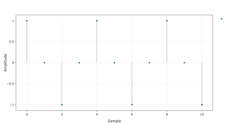
plot_scatterpolar
Polar plots are used to visualize data in a polar coordinate system, which is useful for cyclical data or directional data.
Polar Rose Pattern
This example generates a beautiful rose pattern using a polar plot. The angle theta and radius r are used to create this intricate shape.
# Polar rose pattern
theta = 0:1:360
r = 3 .* sind.(4 * theta)
fig = plot_scatterpolar(theta, r, title="Rose Pattern")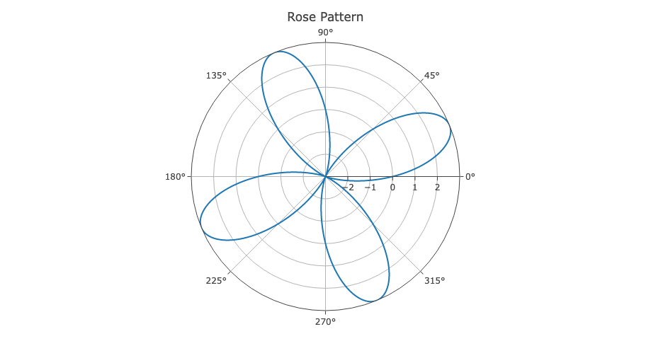
plot_heatmap
Heatmaps are excellent for visualizing 2D data, where values are represented by colors.
2D Gaussian Distribution
This example creates a heatmap of a 2D Gaussian distribution. The meshgrid function is used to create a grid of coordinates, and the color of each cell in the heatmap represents the value of the Gaussian function at that point.
# Gaussian distribution heatmap
x = -8:0.1:8
y = -5:0.1:5
Y, X = meshgrid(y, x)  # uses Meshgrid.jl
Z = exp.(-(X.^2 + Y.^2))
fig = plot_heatmap(x, y, Z, title="2D Gaussian", colorscale="Viridis", equalar=true)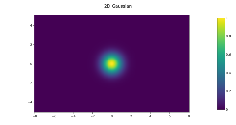
plot_contour
Contour plots are useful for visualizing level sets of 2D data.
2D Contour of Radial Sine
# Radial sine contour
x = -5:0.1:5
y = -5:0.1:5
U = [sin(sqrt(xi^2 + yj^2)) for yj in y, xi in x]
fig = plot_contour(x, y, U, title="Radial Sine Contour", colorscale="Viridis")
Heatmap with Overlaid Shapes
You can enhance heatmaps by overlaying other plots on top using mutating ! functions. This example demonstrates combining a heatmap with a line and circle overlay.
# Create a heatmap with Gaussian distribution
x = -5:0.2:5
y = -5:0.2:5
Y, X = meshgrid(y, x)  # uses Meshgrid.jl
Z = exp.(-(X.^2 .+ Y.^2))
fig = plot_heatmap(x, y, Z, title="Gaussian with Annotations", colorscale="Viridis", equalar=true)

# Overlay a circle (scatter plot with markers)
θ = 0:0.1:2π
radius = 2
circle_x = radius .* cos.(θ)
circle_y = radius .* sin.(θ)
plot_scatter!(fig, circle_x, circle_y, mode="lines", color="red", legend="Circle")

# Overlay a line
line_x = [-4, 4]
line_y = [-2, 2]
plot_scatter!(fig, line_x, line_y, mode="lines", dash="dash", color="yellow", legend="Line")
This creates a heatmap with a red circle overlay and a dashed yellow line, all combined efficiently using the mutating API.
plot_quiver
Quiver plots are used to visualize vector fields, showing both the direction and magnitude of vectors at different points in space.
Vector Field Visualization
This example demonstrates how to plot a 2D vector field representing a circulation field. Arrows indicate the direction and magnitude of the vectors at each point on the grid.
# Vector field visualization
x = -2:0.5:2
y = -2:0.5:2
Y, X = meshgrid(y, x)  # uses Meshgrid.jl
U = -Y[:]
V = X[:]
fig = plot_quiver(X[:], Y[:], U, V, sizeref = 0.5, title="Circulation Field")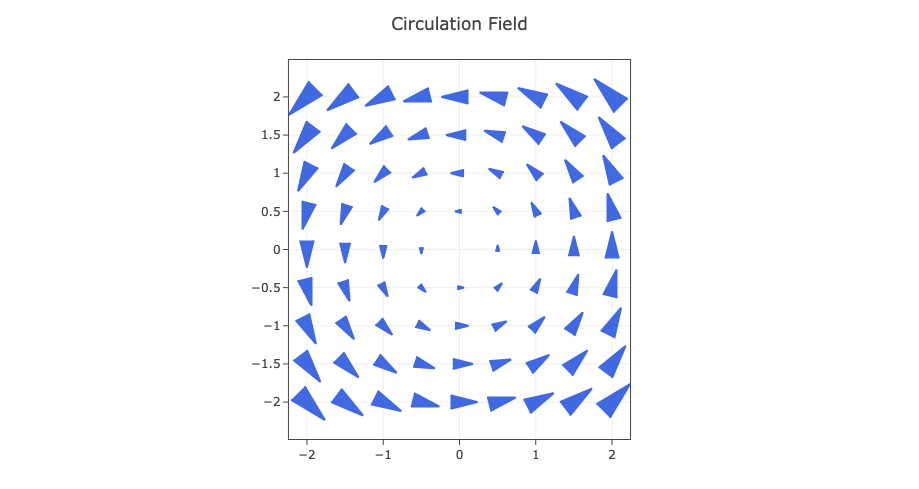
Appending traces to an existing figure
You can append traces to an existing figure using the mutating plot_*! functions. These modify the provided fig in-place, update the underlying Plotly data/layout, and refresh the existing Electron window when fig is a SyncPlot.
# create initial figure
x = 1:10
y = rand(10)
fig = plot_scatter(x, y, title="Base")

# append another trace in-place
plot_scatter!(fig, x, rand(10), color="red", legend="added")
plot_surface
Surface plots are used to create 3D representations of surfaces, which is useful for visualizing functions of two variables.
3D Mountain Surface
This example generates a 3D surface plot that resembles a mountain range. The height of the surface at each point is determined by the function Z.
# 3D mountain surface
x = -3:0.1:3
y = -3:0.1:3
Y, X = meshgrid(y, x)  # uses Meshgrid.jl
Z = 3 * (1 .- X).^2 .* exp.(-(X.^2) - (Y .+ 1).^2)
fig = plot_surface(X, Y, Z, title="3D Surface", colorscale="Plasma")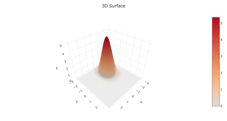
Appending Surfaces to an Existing Figure
You can append additional surfaces to an existing figure using the mutating plot_surface! function. This is useful for comparing multiple 3D surfaces or overlaying analysis results.
# Create initial surface
x = -2:0.2:2
y = -2:0.2:2
Y, X = meshgrid(y, x)
Z1 = sin.(sqrt.(X.^2 .+ Y.^2))
fig = plot_surface(X, Y, Z1, xlabel="X", ylabel="Y", zlabel="Z", title="Multiple Surfaces")

# Append another surface with different values
Z2 = cos.(sqrt.(X.^2 .+ Y.^2)) .* 0.5
plot_surface!(fig, X, Y, Z2; shared_coloraxis = true)
plot_scatter3d
3D scatter plots are used to visualize data points in three-dimensional space.
3D Parametric Curve
This example shows how to plot a 3D parametric curve, in this case, a helix. The x, y, and z coordinates are generated as a function of the parameter t.
# 3D parametric curve
t = 0:0.1:4π
x = cos.(t)
y = sin.(t)
z = t
fig = plot_scatter3d(x, y, z, mode="lines", title="3D Helix")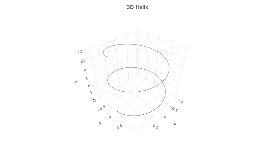
plot_quiver3d
3D quiver plots are used to visualize vector fields in three dimensions.
3D Vector Field Visualization
This example demonstrates how to create a 3D quiver plot to visualize a simple vector field. Each arrow represents a vector with a specific origin and direction.
# 3D magnetic field visualization
x = [-1, 0, 1]
y = [0, 0, 0]
z = [0, 0, 0]
u = [1, 0, -1]
v = [0, 1, 0]
w = [0, 0, 1]
fig = plot_quiver3d(x, y, z, u, v, w, sizeref=0.5, title="3D Vector Field")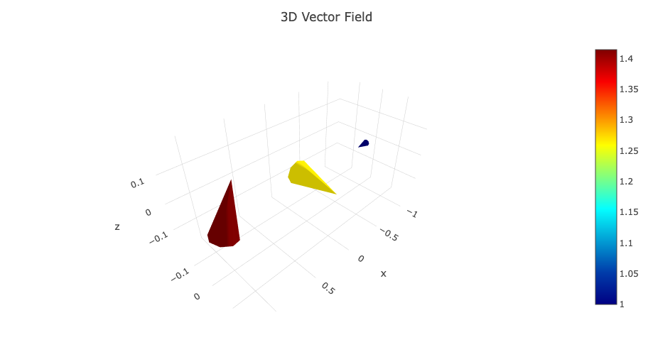
set_template!
You can easily change the theme of your plots using the set_template! function.
Applying a Dark Theme
This example shows how to apply the "plotly_dark" template to a plot, which can be useful for presentations or for matching a dark-themed environment.
fig = plot_scatter(1:10, (1:10).^2)
set_template!(fig, "plotly_dark")